How to use typography to improve accessibility
24/05/2021
 Even if you're not a designer, almost everyone that uses a computer will likely be able to think of a time they've actively chosen a typeface – whether for a document, an email or a piece of marketing communication (e.g. a social media graphic). Understanding how different typefaces can help or inhibit users digest your content can make a big difference to how successful you are as a communicator; and for the visually impaired, or individuals with accessibility issues, your choices can make the difference between a good experience and a negative one.
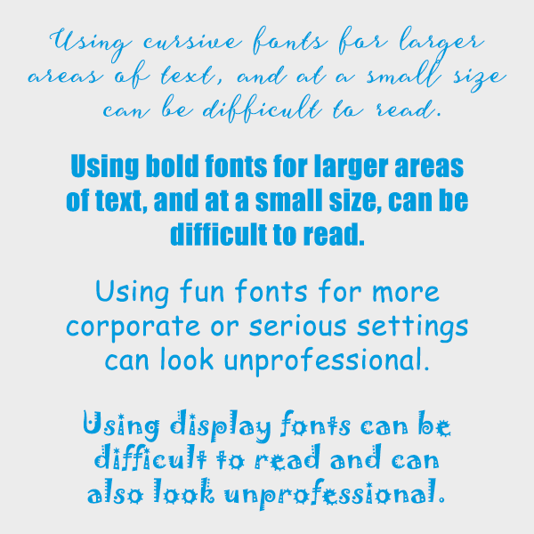
We've all seen examples of bad font choices, such as overly cursive fonts for large areas of text, which can make reading the words extremely difficult, or using Comic Sans for something more serious or corporate. Using overly bolded fonts, such as Impact, or very decorative fonts, such as Joker, can be difficult to read at smaller sizes or across longer areas of text.
For those with visual impairment or learning difficulties (such as dyslexia – thought to affect one in ten people), reading can be more challenging than for other users and it's important to bear these important user groups in mind. Recently, a growing pool of research is helping font designers create new typefaces specifically engineered for users with accessibility issues, as well as for a range of other scenarios. Below we've selected some of our favourites.
OpenDyslexic
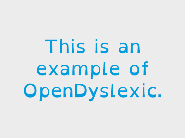 OpenDyslexic is a specialist font that can help people with dyslexia to read more easily. The font works by adding extra weight to certain areas of each letter which indicates the top and bottom, or direction of the letter more clearly. This can also help to stop letters from rotating or flipping, which is a common problem for people with dyslexia. There is also slightly more spacing between each letter which can stop letters from merging, such as r and n, which could look like an ‘m’ if close together depending on the font (rn).
While this font can be useful, it is probably best to use a more standard font for most applications. This could be a great alternative that could be provided as an option, or at the request of the user, if they find this font helpful for larger areas of text.
Tiresias
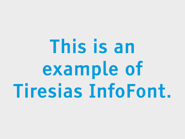 Designed for visually impaired people, Tiresias is a family of sans-serif typefaces designed by the Scientific Research Unit of Royal National Institute of the Blind in London. This font family has different versions depending on the use of the font, for example, there is a separate version for smaller screens, televisions, information labels, signs, keyboards, and large-print publications. Each character was designed to be easily distinguishable, with extra care put into the weight and spacing of individual letters.
Ensuring the correct font is used for the right purpose is vital, as they each work differently at their intended sizes and resolutions.
Dyslexie Font
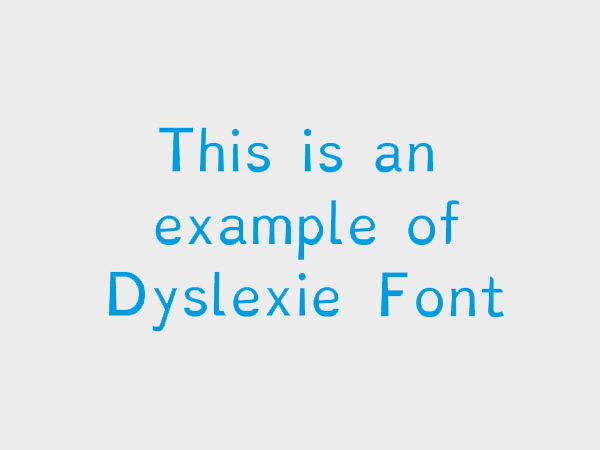 Another font designed for dyslexics is Dyslexie Font. Each character has been created to be individual and clear to read. Some people with dyslexia may get b and d confused, or p and q. This is due to how these are usually the same glyph, just mirrored. Dyslexie Font makes these letters look individually different from each other so they can be easily distinguished from one another, and ensures the fonts are open and ascenders and descenders are extended for legibility.
This font is easier on the eye than OpenDyslexic and could be a great alternative for more varied uses across print and the web.
Sans Forgettica
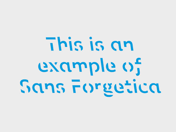 Another font that should be used in moderation in the right setting, or be used as an option by request is Sans Forgettica. This font has been created to make reading harder, which may seem counterintuitive, but because your brain must work harder to read the information, it can actually help you to improve levels of retention. Designed by RMIT University in Melbourne, the font was made by using cognitive principles of psychology to help students retain information from their study notes.
By removing certain points of each letter, your brain must engage in deeper processing to understand what it is looking at, which in turn, should help you to remember the information you are reading easier.