Web Designs Trends of 2018
26/11/2018
Now that we're nearing the end of the year, we take a look at some of the more prevalent design trends that have grown through 2018.
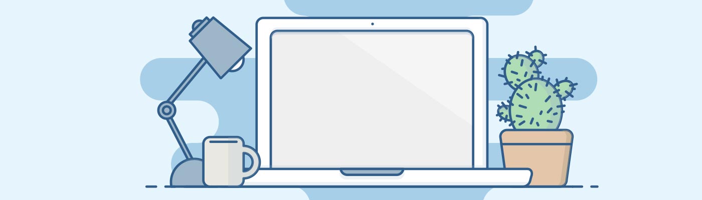
Custom Illustrations
Pictures are worth a thousand words, which may be why illustrations are taking over the web design world! Illustrations can make a big difference to your brand identity and give it a completely different feel. A good example might be if you take a business with a very clean, corporate identity - like a bank - for which illustrations could change the tone of voice for the brand to something more friendly and personal.
When done well, complex messages can be conveyed in a single image, saving the user time reading and reducing the amount of space the explanation would have taken up. This also improves the user experience and encourages greater engagement with the content on your page.
Broken Grid
'Broken grid' and asymmetrical designs are designs that don't fit into a visual grid system typically deployed in a design layout.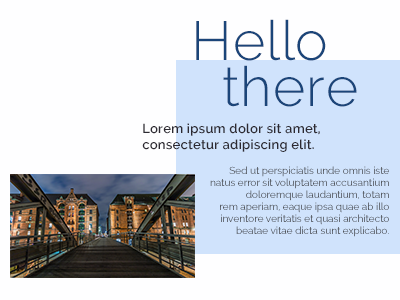 Since these kind of design layouts are not bound to strict parameters, they can often appear experimental and unique. Getting this right is tricky, but when executed well it can really work for companies seeking something more inspirational or quirky.
By going 'off the grid', content can be overlapped in a more fluid way, creating striking and unique juxtapositions of images and typography.
Animations
Animations are another great way to draw attention to your website. As they are  usually custom made, they can add an extra finishing touch of personalisation and enjoyment to the browsing experience. Research suggests users prefer to watch short animations or videos, which can be easier than digesting paragraphs of text. For this reason, platforms like Instagram have been so successful for advertisors in harnessing the power of animation.
Page transitions and scrolling animations are becoming more and more popular too. These can vary from big, bold sweeping page transitions to a very subtle bouncing arrow to tell the user to scroll down to view the rest of the page.
High Quality Photography
Long gone are the days of cheesy stock photography. We are welcoming a new 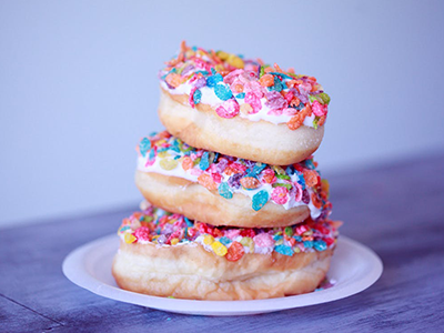 era of fresh, clean, modern photos. Users expect images to be authentic and reflect real life. By using stereotypical stock images, you risk your website looking old fashioned and out-of-touch.
Great photography is especially important for ecommerce websites where any advantage or edge over your competitors is important. Unique and inspirational photosgraphy on an online store will often re-inforce the sense of style/values that customers are often looking for by shopping with you. Conversely, generic, or unporfessional photography can have a severly negative impact on your website and reduce any sense of trustworthiness.
Drop Shadows & Depth
This trend should be used sparingly! By using shadows 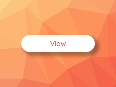 to create depth, you can turn your flat design into something that looks more lifelike and interactive. Adding a shadow underneath a button would make it look as if it’s floating above the rest of the page, ready to be clicked on.
You can also use shadows to establish a visual hierarchy to show which elements are more important or which you should interact with first on the page. Don’t go too crazy with the shadows though or you can cause confusion and put users off from engaging with your page.
Microinteractions
Microinteractions on the web have been around since the early days, but are now  becoming more complex and interactive. If you’ve noticed an element on a website changing when you move your mouse over it or animations that move as you scroll, these are what we typically describe as microinteractions. These subtle visual cues make your website feel more responsive and give users a more enjoyable experience.
Again, this is another addition that must be used carefully. If too many are added it can begin to feel too busy and overwhelming. By adding a modest amount of microinteraction, you can help your visitors navigate through your website and encourage them to keep coming back for more!
Bold Colours & Gradients
The use of bold colours is still growing and gradients are back in fashion. Due to the technological advances in computer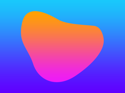 monitors and mobile devices, screens are able to produce brighter colours than their predecessors; designers can therefore be bolder with their colour choices.
Vibrant colours are far more effective at grabbing users’ attention. Many designers are using bright colours to improve the visual hierarchy and to set their designs apart from more traditional websites.
Video Content
Similar to animations, videos are another way to create added value and communicate what 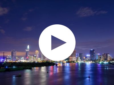 your website is all about. Whether the video is bespoke to your business, explaining what you specialise in, or a stock video used in a decorative or abstract way, they can really help to drive engagament with your content.
Many websites now use a large video into the background of their home page in place of an image or graphical banner. You can still add other elements such as text, buttons and search bars over the video so the website layout is still familiar and easy to use.
Big Typography
Typography is one of the most important elements in a website design.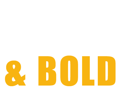 Typefaces can show personality and evoke emotions, which can really help to set the tone of your website and compliment your brand identity. Large, bold type that grabs your attention has become very popular over the last 12 months and doesn’t look like it’s going anywhere soon.
Whilst it's still extremely important to use easy-to-read typefaces for the main body of your website, there's still a lot of room for creativity when it comes to choosing typeface styles. For example, using a bold serif typeface for a header, paired with a sans-serif typeface for paragraphs can look great and reinforce your visual hierarchy, allowing the content to flow.
Hamburger Menus
Although 'hamburger menus' are more commonly seen on websites viewed on mobile phones and tablets, they have begun to creep onto desktop websites too due to their familiarity. This has been a controversial trend, since some audiences argue it reduces usability if you don't know what the icon means. However, when a modern or minimalist look is a greater priority, a hamburger menu may work for you.