
Why Does My Business Need a Strong Logo?
15/05/2019
Take a look around you and see how many logos you can spot in your field of view. I can easily spot at least 10 from where I’m sitting right now! Logos are graphical representations of a brand - with or without descriptive text inside them - that will often attempt to communicate something about a brand's values and identity too. The word 'logo' originated from the Greek language and is an abbreviation of 'logogram', made up of the words " λόγος " (word) and "τύπος" (imprint). The first use of a visual logo was by the Ancient Egyptians who used hieroglyphics to identify their posessions. Laterly in medieval times, logos (sometimes called emblems in this context) were used to distinguish the status of noble families and represent allegorical concepts through coats of arms.
 The primary purpose of a logo is to identify a brand quickly and easily and to help it stand out from competitors. They are used to convey messages that transcend language and culture, and can communicate your brand in a way that words often can’t. Logos allow your brand to be recognised much more rapidily since our brains process images 60,000x faster than text and we can remember up to 80% of images we see, compared to 20% of text and 10% of sound. If someone asked you to describe the Coca Cola logo for example, there’s a high chance you could describe it with some accuracy because of the visual imprint in your mind.
Brands with professionally designed logos often communicate to customers that they 'mean business', showing that you have invested time and effort into your visual identity. A strong logo and branding can be replicated consistently across all of your marketing collateral, such as emails, business cards, websites and social media channels, to give your business a sense of trustworthiness and strength.
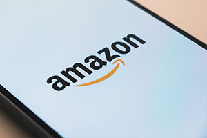 Although the main purpose of a logo is to help identify your business, they can also be used to reaffirm your core values and target market. A good example of this is the Amazon logo, which has an arrow pointing from the ‘A’ to ‘Z’ in their name, emphasising that they offer a huge variety of products. The arrow is also slightly curved to make it look like a smile to make them feel more user-friendly, while the warm shade of orange they use helps to suggest excitement - like the joy you get when receiving something you’ve ordered!
Colour choices are very important in your logo, since colours have been shown to have a measurable psychological effect on us, which we have written about before. For example, red has connotations of being bold and brave, and also stimulates our appetites, which is why many food outlets use this colour in their branding. Blue can gives off trustworthy and dependable notions, which is why it’s often used by banks and tech companies like Facebook, Twitter and Barclays Bank. Choosing the right colour for your brand will influence how customers feel about your company, so finding out which colour matches your values is important.
 When a company is successful, you may not even need to add your business name to your logo anymore to provide recognition - Apple, or the golden arches of McDonalds are great exampes of this. When brands become so famous that most people on the planet can recognise who they are just from the symbolic logos themselves, it goes to show how well a strong logo can perform for your business.
If you have been thinking about getting a logo designed or updated, contact the team today for more information.