10 things users hate
15/07/2022
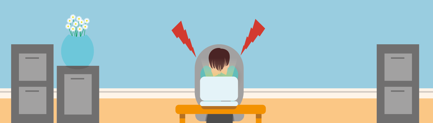
Users across the globe are met with frustrations and usability issues every day. However, more and more businesses are seeing the value that fixing these issues has on their success. Usability issues are hugely discouraging for users, as they prevent them from reaching the goals they set out to achieve with your website. Therefore, if your competitors can provide a better, less frustrating experience, that's inevitably where your users will end up.
Finding precisely where your users have these problems and frustrations can only come from research, particularly usability testing. However, various things are renowned for negatively impacting a user's experience. The following list describes the top 10 things users hate, and that you should therefore avoid implementing on your website at all costs.
1. Not optimised for mobile users
At some stage, we have all come across a site not optimised for mobile, having to pinch and zoom to see content, clicking on buttons that are too small for tapping with your finger. This is not only undeniably frustrating, but not having a mobile optimised site is also damaging for SEO. This is because Google scrutinises websites that are inconsiderate of mobile users by sending them further down in search rankings. It is, therefore, an absolute necessity if a website is to be successful.
2. Cumulative Layout Shift (CLS)
CLS is a user-centric metric for measuring visual stability and refers to how often a user experiences a shift in layout while exploring a website. It can be really frustrating as a user if you’re happily reading an article or browsing a website, when the layout suddenly shifts, and you lose your place or end up clicking on things you didn’t mean to. This can go beyond frustrating and actually ruin a user’s experience entirely if, for example, the position of a button suddenly changes, and they hit ‘pay now’ instead of ‘go back’. It is crucial to measure how often this sort of thing happens on your site, so you’re able to address it if it's a prevalent issue users are facing.

3. Slow loading
Many designers and online business owners make the mistake of assuming their users are patient; they aren't. Users expect webpages to load in 2 seconds or under and are unlikely to wait longer than 3 before abandoning. Although this sounds harsh, many sites have a fast load time, meaning users experience it regularly, and slower sites are now not worth the wait. In addition, there are several things to be mindful of that are likely to increase the time it takes a website to load. For example, big images, too many images, or videos are common culprits.
4. Buttons and links that don't look clickable
Following on from optimisation troubles, buttons and links that aren't obviously clickable can disrupt how well a user can flow through your site. Buttons are crucial for interacting with a website, so if it isn't clear what a button does or whether it's even active, it will be difficult for a user to navigate through your site. If you want to point users in the right direction, make sure Call-to-Action buttons are clear and easy to find. This can be achieved by using contrasting or bright colours for buttons, drop shadows and hover states to make them easily identifiable.
5. Compulsory registration on checkout
Forcing users to register to buy something can be off-putting for many reasons. Some users don't plan on returning and want to make a quick, no fuss, one-time purchase. Users may even feel disheartened when they're told to register, as they know filling out all the fields is a time-consuming process. A recommended alternative to compulsory registration is to provide a guest checkout option.
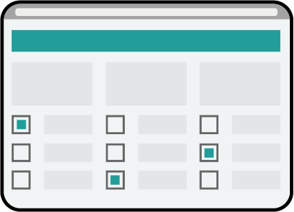
6. Poor navigation
When users first land on your site, do they know where they are? Where they can go? How to get there? Even if the answers are obvious to you, if your website has poor structure and is missing certain features, users will find it hard to navigate. Some of these crucial features include; clear CTAs to get the user's journey started, an easy-to-understand menu or navigation bar, meaningful headings on pages and breadcrumbs.
7. Too many pop-ups
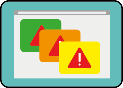
Pop-ups are a tricky one to get right. On the one hand, pop-ups can act as navigational guidance and improve a user's experience, or they can even help increase conversion through an exit-intent pop-up. However, when a user's journey is constantly interrupted by useless, invasive pop-ups, or the worst of all, ad-popups, this causes a lot of frustration. Users don't want to keep clicking X on irrelevant pop-ups and will exit the site if there are too many.
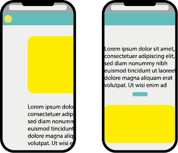
8. Fully Justified text
To ensure your website is coherent and understandable fully justified text should be avoided. Fully justified text is challenging to read at the best of times for any user; however, for dyslexic users, it can be a substantial obstacle. The jagged edges on left-aligned type may look messy to some, but they serve a crucial purpose; uneven edges make it far easier for the reader to find the following line and seamlessly continue reading. Justified text on the other hand, while it produces lovely clean edges, creates a mess inside the text block. Uneven spacing and disrupted kerning between letters leave a clutter of letterforms for your user to decipher.
9. Too much copy
Paragraphs after paragraphs of copy can be visually overwhelming, and if a user isn't expecting to read lots to find what they're looking for, they simply won't. For example, if a user has landed on your homepage and wants to know what you do, a 500+ word paragraph won't feel very welcoming. Instead, a concise line or two of text is all they expect to find and all they have the patience to read. Long descriptions of products can be another pitfall. Instead, pitch how the product will benefit them and list key information clearly without streams of additional text. Another common copy mistake is cramming your copy with keywords. With Google's more sophisticated algorithm, stuffing web pages with keywords is no longer necessary for SEO. In fact, stuffing your webpage with text can result in Google penalising your page in searches.
10. Autoplay videos
The last thing a user wants is to be blasted with sound when they enter your webpage, particularly if they were unaware their computer was on full volume. Sometimes, it is quicker for the user to select the back button than to fiddle with volume controls or locate the mute button. In this case, videos can lead to a high bounce rate, users land on your page and quickly bounce off because they weren't expecting a loud video to play automatically. If you want to add video content to your site, allow the user to choose when to play it. It should also be considered that autoplay videos can be quite distracting, be careful how loud, flashy and disrupting your video content is to the user's journey.