

Microsoft’s new default font proposals receives visceral social media response
15/06/2021
The default font for Microsoft products has been Calibri – an easy-to-read sans-serif typeface, chosen for the 2007 release of Microsoft Office. Some users will still remember when Times New Roman was the default font of choice for Microsoft software.
Recently, Microsoft has commissioned the creation of five new custom-made fonts, which they plan to test (with help from social media users) in the hope of finding a successor to Calibri, adding that “it’s time to evolve”. While Calibri will still be available to use in Microsoft programmes, the chosen new default font will give Microsoft products these a minor style refresh. In their own words: “A default font is often the first impression we make; it’s the visual identity we present to other people via our resumes, documents, or emails. And just as people and the world around us age and grow, so too should our modes of expression.”
Microsoft is asking for everyone's opinions on the different fonts on Twitter, to gauge interest with the general public too. It appears that so far Bierstadt, Grandview, and Tenorite are looking like the front runners, with users saying they are easy to read, even in their different styles such as bold and italic, too. Seaford and Skeena are seen to be less popular, with the varied weights in the letters themselves making it challenging to skim at smaller sizes.
While the new fonts Microsoft has been testing may look similar, they each have their own small details which differentiate them from the next.
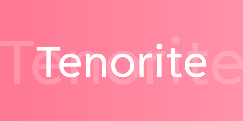
Tenorite
Created by Erin McLaughlin and Wei Huang, Tenorite is based on traditional sans serif fonts such as Calibri, but wider and friendly in comparison. The punctuation for this typeface is said to be larger and bolder than it may typically be to make it easier to read at smaller sizes on screens. They also gave Tenorite generous letter spacing to make scanning the font easier in bigger paragraphs, as you might write in Microsoft Word.

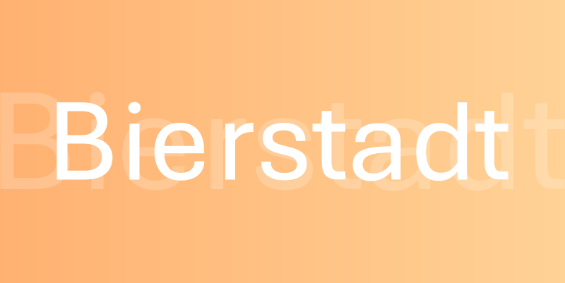
Bierstadt
Steve Matteson was given the task of creating a “grotesque sans serif” for Microsoft, which is a very blocky and bolder style of font. It lacks any flourishes or contrast in the strokes of the font, which can make them highly readable. Helvetica and Arial are both well-known fonts that are similar in style to Bierstadt. Matteson wanted this to look mechanical and rationalised, with the ends of the letters being sheared at sharp, 90º angles for high contrast.

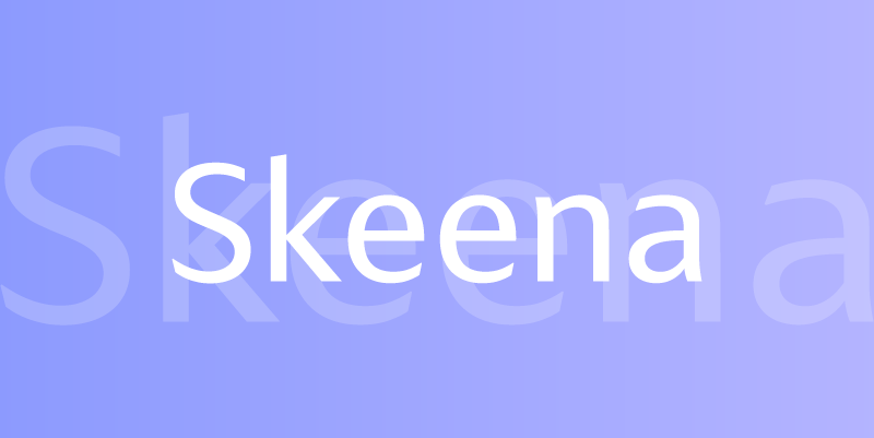
Skeena
Skeena was designed by John Hudson and Paul Hanslow. This font noticeably tapers on the ends of many strokes which gives it a distinctive look, and also has a slightly slanted slice too. Being somewhat more decorative in this way means it would work well in shorter areas of text such as brochures or PowerPoint presentations, as well as being easy to read in longer paragraphs. Skeena also has a more human touch, with the fluid movement of the lettering and modern overtones.

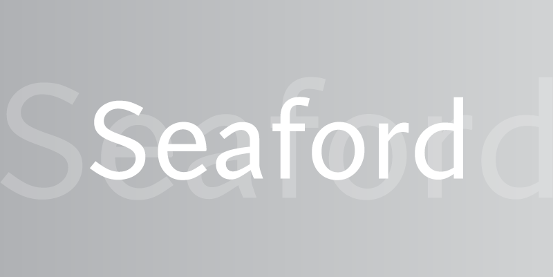
Seaford
Tobias Frere-Jones, Nina Stössinger, and Fred Shallcrass worked together to create the font, Seaford. Interestingly, this sans-serif has been based on the shapes from traditional serif fonts, which creates a familiar and inviting feel with a modern spin. The trio wanted this font to look comfortable, so actually looked to old armchairs for inspiration which are practical and durable. Seaford has more shape and body which keeps the font looking unique and interesting.

Grandview
Created by Aaron Bell, Grandview is inspired by the typeface used on road and railway signs from Germany, which are legible in poor visibility situations or from further away. While these fonts were originally designed for short areas of text, such as signs, they do not traditionally work well for longer areas of text. Bell took on the challenge to tweak the font in areas such as height and width to make this typeface work for general use in Office programs.

Over the next few months, Microsoft will be testing these fonts internally to decide on their champion, as well as inviting users to give their thoughts and feedback via social media.
