Skeuomorphism: The Lost Art of Familiarity in Digital Design
07/06/2023
In today's digital world, design trends come and go more rapidly than ever. One such trend that would provoke feelings of nostalgia in most is skeuomorphism. The word itself is derived from the Greek words "skeuos" (meaning a vessel or tool) and "morphe" (meaning form or shape), it refers to the incorporation of familiar real-world objects or cues into digital interfaces. The design technique has received both criticism and praise over the years, and while it is now regarded as outdated, the significance of skeuomorphism remains worthy of exploration.
What is Skeuomorphism?
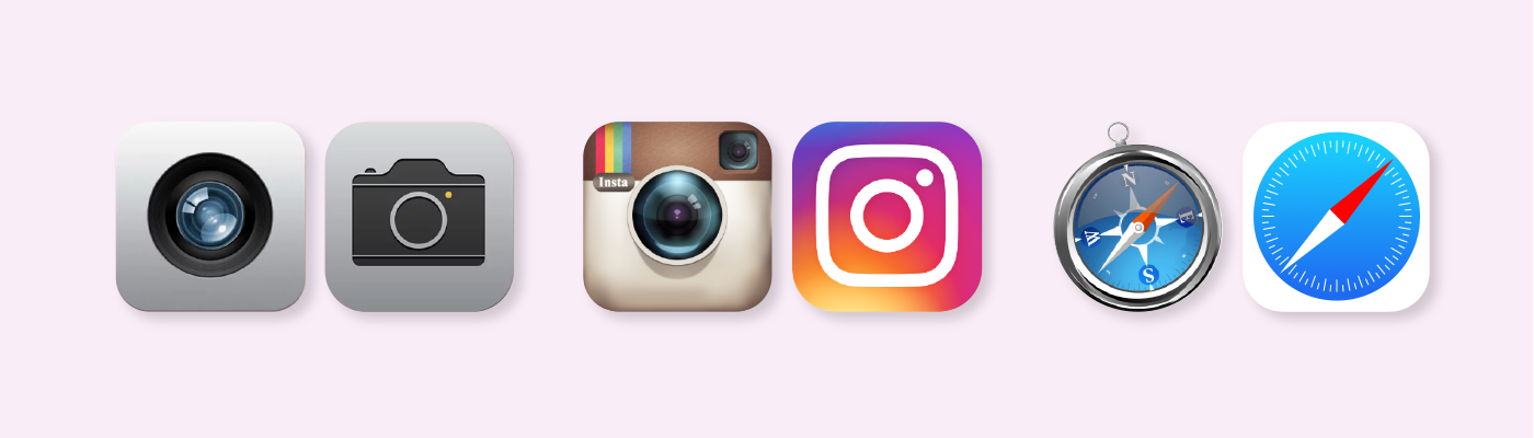
Skeuomorphism, is ultimately an attempt to bridge the gap between the physical and digital world. The theory is that by mimicking elements of objects in real life, users can learn to use their digital counterparts more efficiently. A common example of this is the rubbish bin, in real life you would use this to get rid of something. Similarly, on a digital application a rubbish bin icon signifies how to delete or remove something. Therefore by leveraging a person's familiarity with tangible objects, they are able to learn how to use an interface much faster. Skeuomorphic elements aren't just icons, they can be observed in various aspects of design, like buttons, textures, and animations.
The Origins of Skeuomorphism
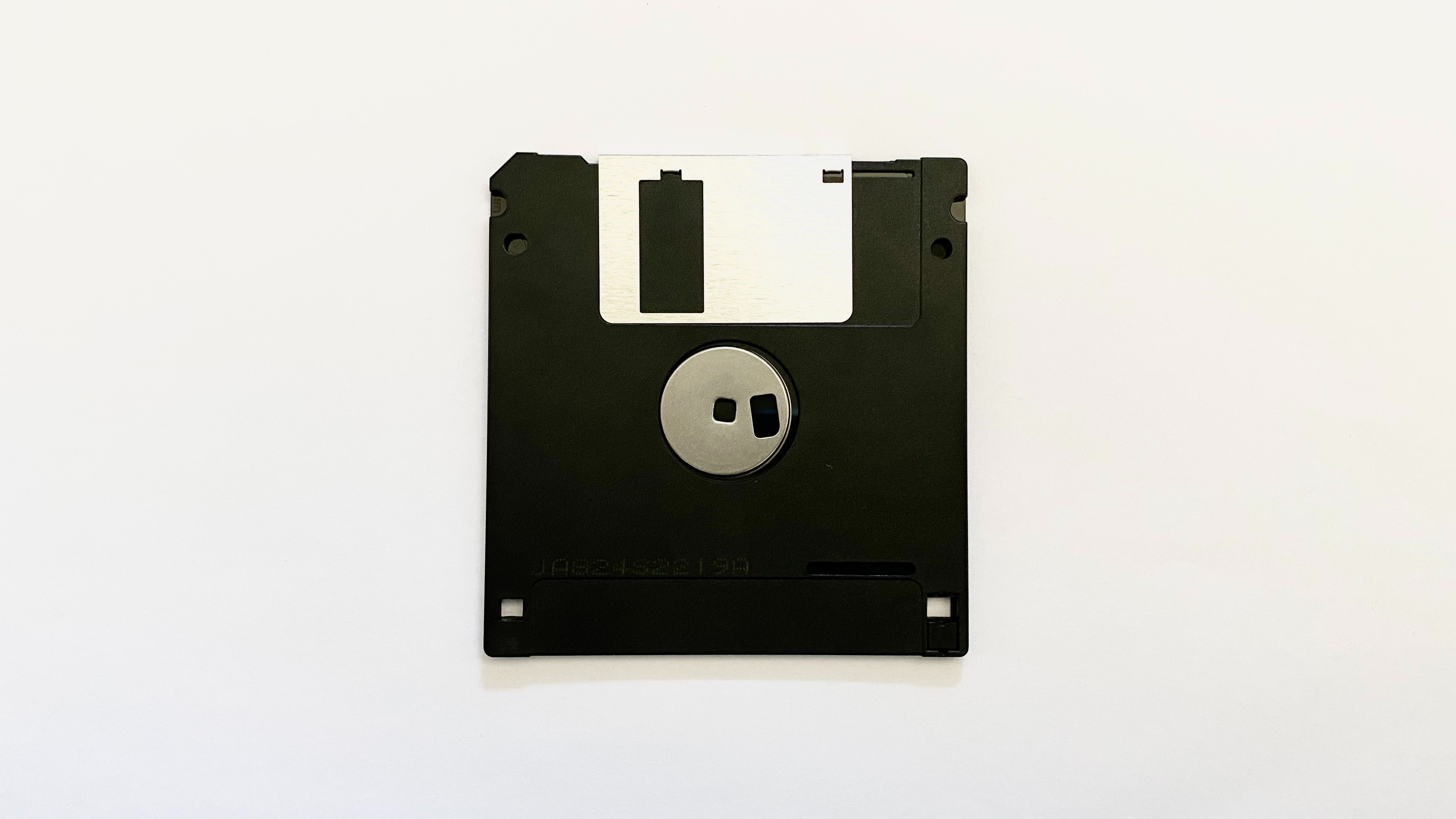
Skeuomorphism was introduced in the 1980s, and by the 2000s was a very popular design trend. During this time, Steve Jobs was one of the trend's biggest supporters. He believed in the early days of computer interfaces, skeuomorphism would be a great help in easing the transition from having never used a computer before to using one on a daily basis. An iconic example of skeuomorphism is the floppy disk save icon, most growing up today won't have ever seen a real floppy disk, but to the early generation of computer users a floppy disk icon made complete sense, and helped them quickly learn how to save their work.
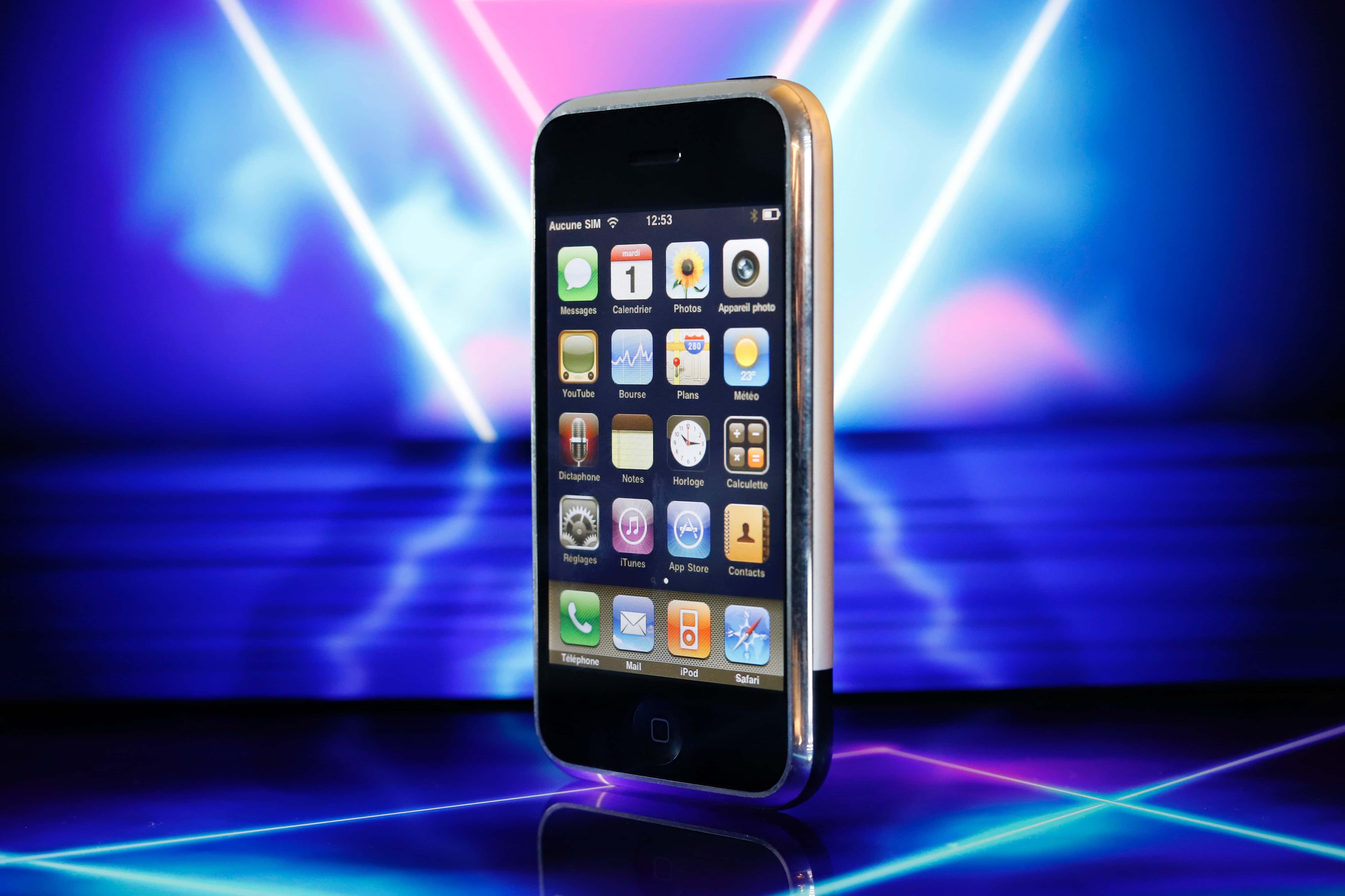
Another notable example of skeuomorphism was Apple's iOS prior to the release of iOS 7. The pre-iOS 7 design featured richly textured icons, such as the wooden bookshelf design of the iBooks app, or the voice memo app that used a realistic microphone graphic. These designs aimed to create a sense of familiarity and comfort by replicating the physical counterparts of digital features.
Early digital music players offer another example of skeuomorphism, which often resembled physical audio devices like tape players or vinyl record players. These digital interfaces featured virtual buttons, sliders, and even animations that mimicked the physical actions and behaviours of their analogue counterparts.
The Rise of Flat Design
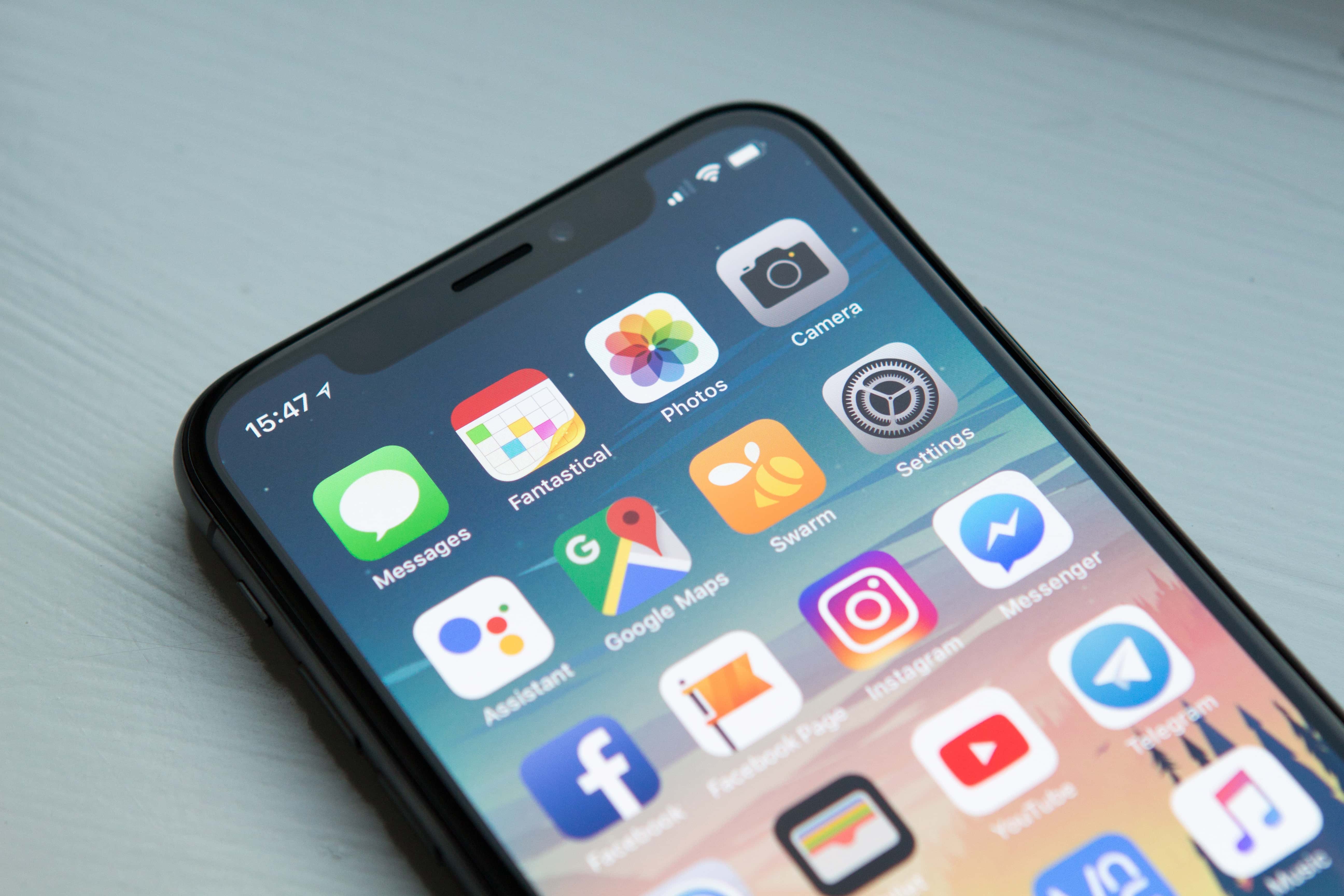
While Skeuomorphism had a lot of advantages, over time, there has been a significant shift in design trends, leading to the rise of flat design. Flat design emerged as a response to the limitations and drawbacks of skeuomorphism. On mobile, in paticular, skeuomorphic designs had usability issues because they often relied on intricate details that didn't translate well to small screens. Flat design on the other hand embraces a minimalist aesthetic, removing unnecessary visual clutter and focusing on clean lines, vibrant colours, and simplicity. Flat design aimed to create a more modern and streamlined look, which was particularly well-suited for mobile devices and responsive web design.
Furthermore, flat design aligned with the emerging design principles associated with the digital age. As technology advanced, people became more accustomed to digital interactions and didn't necessarily require skeuomorphic elements to understand the purpose and functionality of digital interfaces. In fact, skeuomorphic design is now criticised for being excessive, visually heavy, and outdated.
Does Skeuomorphism have a Place in Today's Digital World?
Skeuomorphism played a significant role in bridging the gap between the physical and digital realms. By incorporating real-world elements into digital interfaces, it provided users with a familiar and intuitive experience. While the design industry has shifted toward minimalism and functionality, it's important to note that skeuomorphism hasn't completely disappeared. Elements of skeuomorphism can still be found in certain design contexts, especially in branding or applications that aim to evoke a specific nostalgic or tangible feel. Additionally, design trends are ever-evolving, and it's possible that future shifts may bring about new design approaches that strike a balance between skeuomorphism and flat design, incorporating the best of both worlds.