
The psychology behind web design
16/12/2020
In web design, the term ‘User Experience’ (UX) is widely used when talking about all aspects of a user’s interaction with a website. Research into the psychology of human behaviour has shown that behaviour in general often follows common patterns, linked to the way we process and respond to stimuli; unsurprisingly, these same patterns and observations can also be found when analysing UX and the way we interact with digital products. The reoccurrence of these patterns in user behaviour can help designers and website owners to hypothesise about how users will interact with their site, using modern analytics tools to test these hypotheses to measure the success of decisions and promote further learning.
Out of the many psychological theories applied to UX design, this month we’ve focussed on what we believe are the five most important for website owners to be aware of.
Hick’s Law
In 1952, two psychologists by the names of William Edmund Hick and Ray Hyman set out to discover the relationship between decision-making and the number of options presented. Hick and Hyman found a direct correlation between the number of options presented to a participant and the time taken to make a decision – i.e. the more options, the longer it took to decide. Hick’s Law has incredibly important implications for web design since websites often need to present a user with a significant amount of information and opportunities for interaction, whilst ensuring they’re not overwhelmed or confused. The problem with requiring users to spend a long time making decisions is that they can become susceptible to decision fatigue. This phenomenon can mean they are more likely to disengage and may end their journey on your website or app.
If you’re a Netflix subscriber, you can see Hick’s Law at work when you hit your home page; instead of seeing every programme the platform has to offer straight away, you’re presented with a smaller selection. In the case of Netflix and many other websites and apps, this selection is further personalised using an algorithm that takes your past behaviour and preferences into account – all in an effort to reduce the amount of stimuli you might want to see to the absolute minimum. You may have also seen Hick’s Law being applied when making complex purchases or comparing subscription levels for services; for example, there is often a “recommended” product or plan that shows the best value for example. This is designed to give you a good base to start comparing from and reduce potential friction if they were to show you every option available.
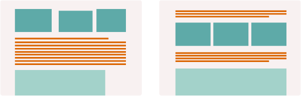
Hick’s Law has been further complemented by Gestalt design principles, which amongst other things places a high importance on ‘visual hierarchy’. This involves using variables, such as size, colour and positioning to give design elements greater or lesser importance. In this way, Hick’s Law can still be seen at work in websites where you might need to present the user with a significant amount of information or options without overwhelming them, such as on an ecommerce website. When it’s hard to remove lower priority design elements that need to be there, visual hierarchy can be established to subconsciously reduce ‘noise’ and draw the user’s attention to most important part of a page (e.g. on a product page, this could be the product name, price and the ‘Add to Basket’ button). For this reason, recent years have seen a big upturn in minimalist design, since a lack of distraction can aid a user’s journey through a website.
In summary: keep the number of decisions a user has to make to a minimum and ensure complex tasks are made as simple as possible.

Aesthetic Usability Effect
In 1995, two researchers from the Hitachi Design Center, Masaaki Kurosu and Kaori Kashimura designed a study to test the relationship between ease of use and aesthetic appeal. In the study, participants were required to rate designs in terms of how easy they found them to use and how appealing they were visually. The results showed that when participants rated a design with a high aesthetic appeal they were more inclined to also give it a higher score for usability. Kurosu and Kashimura concluded that users will perceive a design to be more user-friendly when they like the visual design.
This study provides incredibly valuable insight for website designers and owners and should be used to inform important decisions about how a website looks. Notably, it suggests an important relationship between form and function, where both share a somewhat symbiotic relationship to overall user experience.
In summary: Ensuring your website is aesthetically pleasing will encourage users to feel more positive about the way it works and even more tolerant of potential usability issues.
Jakob’s Law
Lauded as "the world's leading expert on Web usability" (U.S. News & World Report), Jakob Nielsen deserves to be a household name to anyone with an interest in UX design and the psychology around web design. Jakob’s Law proposes that since users spend the majority of their time on other websites, when they navigate to yours they bring all their previous online experiences and expectations, and this impacts their perception of how easy and enjoyable your website is. Nielsen argues that users prefer websites to be consistent with one another and all work in the way they’re used to. For this reason he recommends following a design approach that other users will be accustomed to from elsewhere on the web, paying close attention to trends and standards in UX design.
In summary: Ensure your website works in a consistent way to other websites your users will likely spend time on.

Postel’s Law (Robustness Principle)
A member of the Internet Hall of Fame and celebrated by many as the “god of the Internet”, Jon Postel is remembered for his design guideline known as the ‘robustness principle’, which advises that designers and programmers be conservative in what they send, and liberal in what they receive. In other words, if you are sending information, either to a user or a database for example, make sure that information is correct, concise, and clear. If you are asking a user or another system for information, ensure that you’re flexible and expect data or interactions that vary greatly and don't always conform.
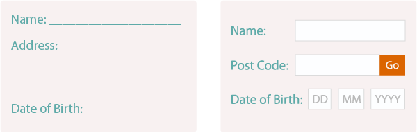
One practical example of Postel’s Law at work is with form design. Most websites have a form of some kind available to users, whether it’s a contact form or a series of forms you complete during a checkout journey. According to Postel, form inputs should be designed to make it as easy as possible for a user to complete, which means they should be flexible enough to expect data in a wide ranges of formats. A form that demonstrates the robustness principle at work would offer the user things like real-time validation to tell them if they’ve input the data correctly (and if not, why), auto-formatting, so that even if they entered data with the wrong spacing or case, the form will re-format it for them, and so forth.
Postel’s Law also carries wider implications for the way websites are designed however; at a fundamental level, it suggests both website designers and owners should be prepared and tolerant of users acting in unexpected ways. When this philosophy is correctly applied, a website should demonstrate enough flexibility to accommodate that variation in behaviour.
In summary: Don’t make your website too rigid, and make allowances for users behaving in unexpected ways.
Reference Dependence
Reference dependence is a theory that proposes people make evaluations by comparison and weighing their judgements against available information they can relate to. In the context of web design, this would suggest users make decisions by comparing one scenario/product/decision against another, and furthermore, when asking a user to make a choice, a suitable amount of comparisons should be provided for their evaluation (but not so many it becomes overwhelming). A working example of this could be a comparison table for example, where the user is able to compare the benefits of different products/services in a clear and easy way.
Less obvious examples of reference dependence that still have an impact on user experience can be found in the proximity given to different elements on a web page. If you have a page on a website showing off a couple of different ranges for example, such as curtains, lampshades and cushions, reference dependence would suggest that ensuring there is sufficient space between the options will help users to differentiate between the content types and to make a decision more effortlessly.
In summary: Aim to make users’ time on your website as effortless as possible. Keep the design clean, ensuring the website is simple to browse through.

If you’re interested in discussion UX in more detail with a member of our team, please get in touch.