How to Choose the Right Fonts for Your Brand and Website
21/08/2025
You probably don’t think much about fonts when you land on a website, but your brain definitely does. The fonts you choose carry tone, personality and usability in equal measure. Get them right, and your brand feels polished, coherent and intentional. Get them wrong, and you risk sending mixed signals, losing legibility or undermining trust.
Here’s how to think about typography intentionally, not as an after-thought, but as a key element of brand identity and user experience.
Why Typography Matters
Fonts are more than pretty styles for your text. They inform how your audience feels about you and how easily they process your words.
- Typography sets tone: A refined serif font may signal tradition or luxury, whereas a bold sans-serif might suggest modernity and clarity.
- Typography drives readability: Poor letterforms, too tight spacing or inconsistent choices confuse users and slow comprehension.
- Typography reinforces brand coherence: When you carry consistent font styles across web, print, social and packaging, you build recognition and trust.
Define Your Brand Personality First
Before choosing fonts, clarify your brand’s voice and positioning. For example:
- Are you friendly or formal? Playful or serious? Innovative or classic?
- Who is my audience and what tone will resonate with them?
- Do I want to feel approachable, exclusive, expert, quirky?
If your brand is an artisanal food product, you might lean into something hand-crafted, with subtle quirks. If you’re a tech service, you might favour clarity, minimalism and trustworthiness. Once you have defined your personality, you will have a clearer direction for choosing fonts.
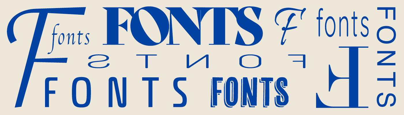
Font Families: Understanding the Options
Here are the main categories and how they might serve your brand:
- Serif (e.g Times, Georgia, Garamond). These fonts have little serifs or “feet” at the ends of letters. They often feel traditional, formal, reliable. Great for brands with heritage, depth, or editorial-style content.
- Sans-serif (e.g Helvetica, Open Sans, Montserrat). Clean, modern and legible. Ideal for digital first brands, tech, minimal layouts.
- Slab serif (e.g Rockwell, Museo Slab). A hybrid style, with chunky serifs. These fonts have strong presence and can feel bold and distinctive.
- Script / Handwritten (e.g Pacifico, Lobster). Decorative, expressive and best used sparingly (the odd heading, logos) because legibility is impacted when used with body text.
- Display / Decorative (e.g Monoton, Righteous). Highly stylised fonts for large headers or brand marks, these should never be used for body copy or any text that needs to be legible.
Choose a Primary and Secondary Font
Most brand and website typography systems work with (at least) two fonts:
- Primary font: This is your workhorse, used for body text and general content. It should therefore be highly legible across devices.
- Secondary font: Used for headings, subheadings, or large displays. This is where you can inject more character or contrast.
When picking these make sure, they complement each other, but are different enough to create hierarchy. It can also help if they share some characteristics, like x-height or weight range to avoid a visual mismatch. Also, crucially, you must check your chosen fonts are readily available as web-fonts or are web-safe, and whether you need to obtain a license for them or not.
That said, you don’t always need two different typefaces. A single, versatile font family can work beautifully if you define clear rules for hierarchy and weight. For example:
- Headings always use Bold
- Sub-headings use Medium
- Body text uses Regular or Light
This approach keeps your design cohesive while still giving structure and rhythm to your typography. It’s also great for performance, fewer font files mean faster load times and a more unified look.
Accessibility and Globalisation
Your typography should support all users, including those with impairments, and consider localisation:
- Use sufficient contrast (text vs background). Poor contrast affects readability and accessibility.
- For body text, larger size is often better, especially on mobile.
- If your site supports multiple languages, ensure your font has the necessary glyphs and diacritics.
- Avoid relying solely on courier-type or decorative fonts for essential navigation or content, stick to legible fonts for core tasks.
Final Thoughts
Typography is one of those elements that quietly underpins good design. When done well, users don’t notice it, they just feel comfortable, trust what they’re reading, and focus on the message rather than the medium.
If you’re looking to refine your brand’s typography or elevate your website’s visual identity, get in touch today to see how we can help.