
The Future is Dark…
01/07/2019
You may have noticed that some of apps or websites you have visited recently have turned to the dark side!
It has been more common over the last decade for websites and apps to be based on lighter colour schemes that use light/white background colours. This approach is considered to offer a 'clean' and high contrast aesthetic that users are familiar with from newspapers, books and letters. In fact, the dark-on-light approach has been prevalent for so long that you can observe it from cave paintings thousands of years ago that were generally found to be on light-coloured rocks, drawn on with a darker colour using charcoal or burnt animal bones.
A new trend is on the rise however with user interface (UI) designers now starting to cross over to the 'dark side' more often, creating deep and dramatic-looking experiences. This usually involves using a dark coloured background with white text and bright accent colours to ‘pop’ out from the background. Dark UI's should be used carefully however, as they should still match your brand, appeal to your target audience and consistently emphasise the right emotions for your message.
You may have also noticed 'dark modes' becoming available on your smartphone with recent updates. When browsing the internet at night on your phone, you may see the colours have inverted from how it would normally look; the once white background is now black and the text is white. Some apps and websites also have an option to turn 'night mode' on, which for some will switch the usually bright colours to darker counterparts.
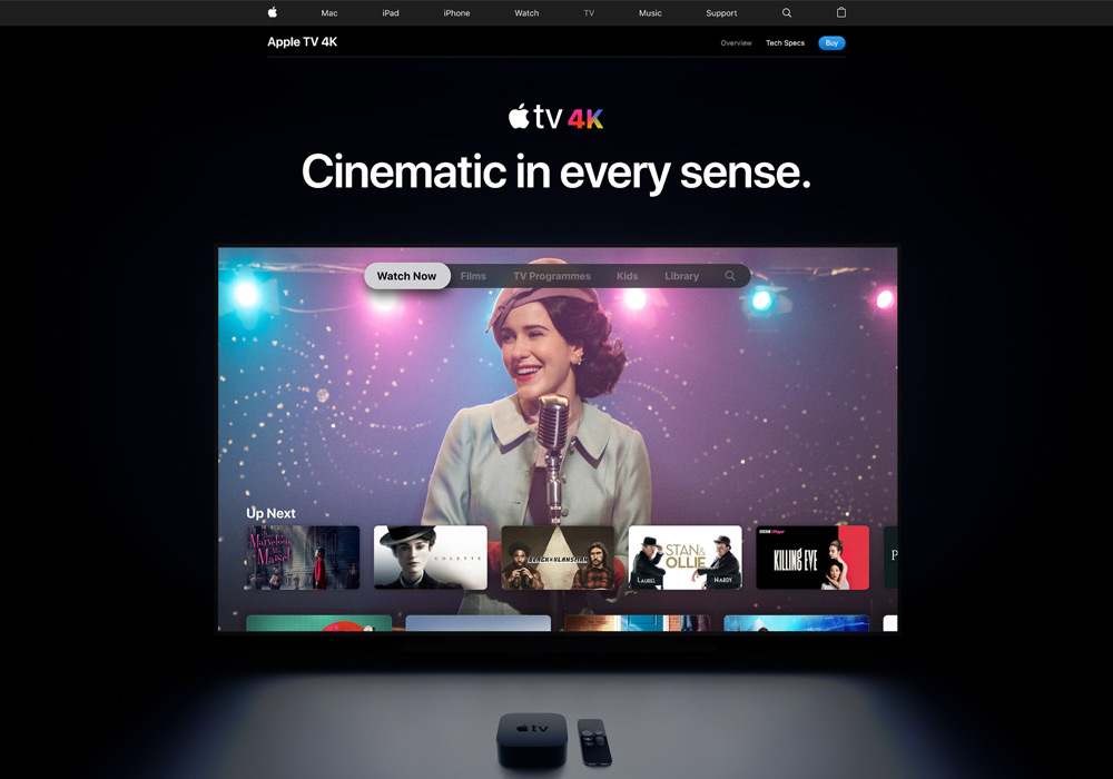
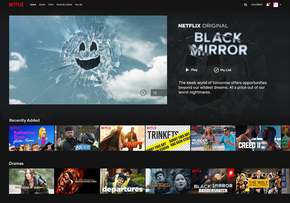
Dark user interfaces have long been common for some brands, especially streaming services such as Netflix, Amazon Prime Video and even Spotify. Since you are more likely to be using these services in the evening, a dark UI is utilised since darker screens help reduce eye strain and improve overall experience in low-light environments. It also gives it that extra entertainment feel, like being in the cinema or at a concert. Most of these services keep their designs very simple and clean, often using black or dark grey with a white or other single colour for text and interactions, keeping your focus on the imagery.
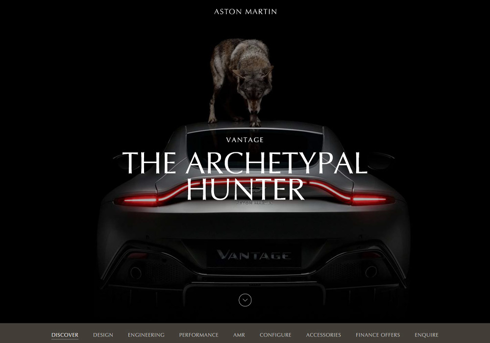
Dark UI's also work well when you need to create a high-end luxury look and feel. They are often used to display cars, watches and jewellery. Showcasing a product front and centre on a darker background with some short instances of text and sleek call-to-actions can help draw attention to it, as long as you keep the rest of the design simple. And it's not just black that works well for a dark UI - if it suits your brand identity, dark blues, purples, reds and many other variations have been used effectively.
Simple and classic is a great look, but using a dark interface doesn't mean your design has to be monochrome. You can add in many bright colours, images or illustrations to bring the page alive and create a completely different mood. This could deliver a fun and exciting feel with a mysterious side, or communicate a serious or even corporate message if you pick the right colours and use imagery sensibly.
If you think your website or app would benefit from going to the dark side, contact a member of the team to have a chat!