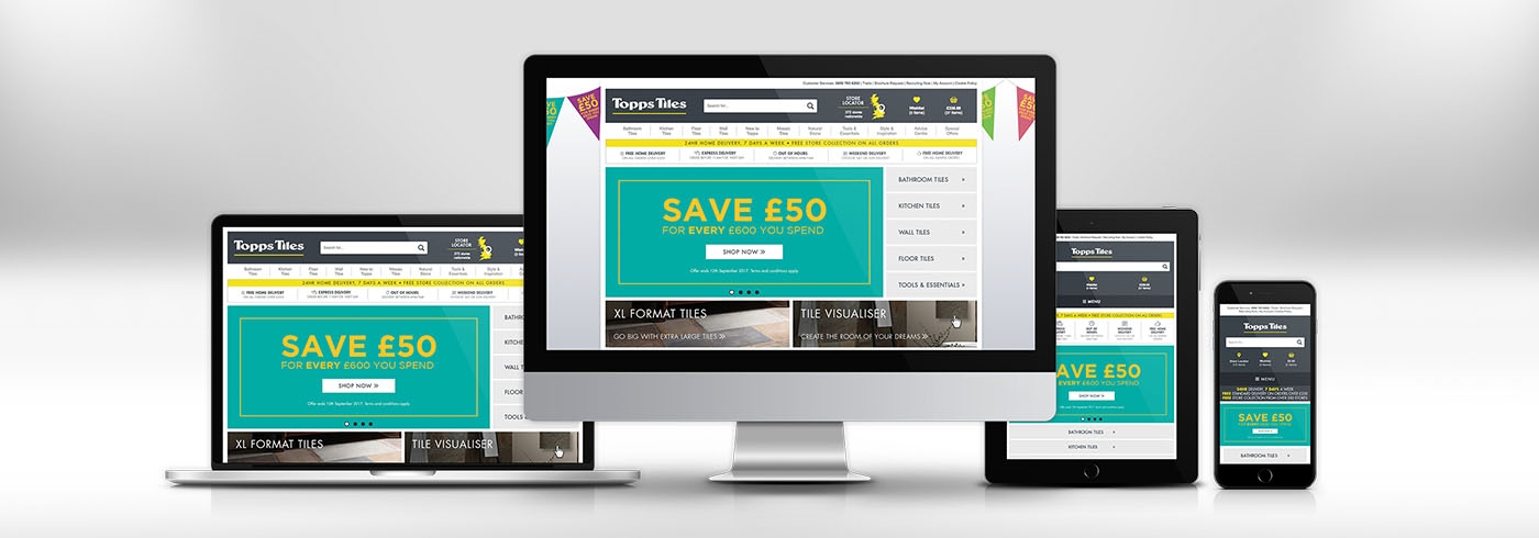
Topps Tiles Goes Responsive
01/09/2017
We’ve been very busy this summer completely re-writing the Topps Tiles website using mobile-friendly Responsive Web Design (RWD) techniques to ensure it can adapt to suit any screen size. This has helped to streamline the ongoing management of the content and means there is a single code base to maintain.
If you’re unsure if your website is mobile-friendly, or you’d like to speak to a member of the team about Responsive Web Design, please get it touch.